“People count up the faults of those who keep them waiting” Seems like I kept them busy decoding this loading bar 😀
Recently, while browsing I landed on a page on StackOverflow.com where people were discussing how I implemented this loading bar on www.iogoos.com I could sense a lot of confusion in the discussion so thought I would take the mystery out as I love to share best practices. Here’s how you can create a loading bar in a few steps…
Things You’ll Need
A nice loading image: If you are good at creating animated GIF images that are nice, otherwise you can create a loading image with this cool Ajax Loading Gif Generator.
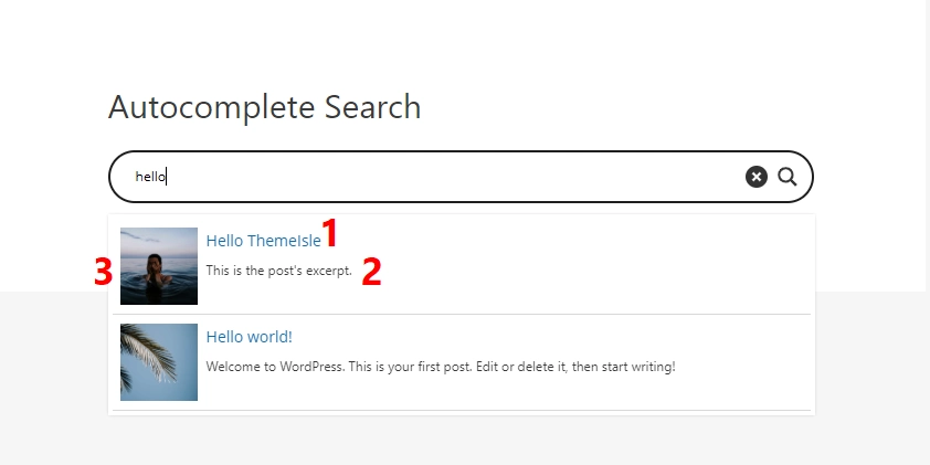
I am pretty sure that you are aware of Google Search Suggest and Yahoo Search Assist features. This feature helps you effortlessly find exactly what you’re looking for. No doubt, it lists a few suggestions to keep the user looking for more and more.
As you type something in the search box, it automatically offers search terms and phrases in real-time. How nice will it be to have the same feature on your website or blog. In this post, I am going to explain an easy way to add a search suggestion feature to your WordPress blog or website.
Things You’ll Need
jQuery: You can download the latest version from jQuery.com Autocomplete Plugin: Download this plug-in by Jörn Zaefferer from //bassistance.de
Here I am assuming you are using “js” folder to keep all your java scripts and supported files. You may need to update the location of these files based on your folder setup.
Here’s the actual jQuery code to enable this feature on an input box:
<script type=text/javascript>
    var data = "Search Terms Separated With Spaces".split(" ");
    $("#myInputBox").autocomplete(data);
</script>
Variable “data” hold the terms that you would like the user to see in the search suggestion list and $(“#myInputBox”) is the id of the search input box.
Let’s check out how we can automatically call WordPress tags in our search suggestions, using WordPress wpdb class:
<?php
    global $wpdb;
    $search_tags = $wpdb->get_results('SELECT name FROM $wpdb->terms');
    foreach ($search_tags as $mytag){
        echo $mytag->name. ' ';
    }
?>
Here I am using WordPress wpdb class to fetch all tags assigned to the posts.
Here’s the complete code to enable this feature on your WordPress blog. Just replace the folder name with actual folder and the jQuery selector $(“#myInputBox”) with the actual id of search input box.
<script type=text/javascript src=PATH_TO/jquery.autocomplete.pack.js></script>
<link href="PATH_TO/jquery.autocomplete.css" rel="stylesheet" media="screen" type=text/css />
<!-- This goes in the head -->
<script type=text/javascript>
	$(document).ready(function(){
		var data = '<?php global $wpdb; $search_tags = $wpdb->get_results("SELECT name FROM $wpdb->terms"); foreach ($search_tags as $mytag){ echo $mytag->name. " "; } ?>'.split(" ");
		$("#ID_OF_SEARCH_INPUT_BOX").autocomplete(data);
	});
</script>
Don’t forget to add your inputs in the comments section below.
As you already know that I’ve been working on improving the performance of my website and I needed a simple solution to create a light-box effect for Live-Chat on this website. I had many options to choose from available jQuery plug-ins however, the idea was to optimize the code with minimal use of heavy third-party scripts and CSS. Moreover, the only thing I needed was a light-box effect without any other functionality.
So I created the light-box effect with a few lines of code using CSS and jQuery.
Let’s start coding 🙂
xHTML Code
Place this code within <body></body> tags where ever you like.
<a id="show-panel" href="#">Show Panel</a>
<div id="lightbox-panel">
<h2>Lightbox Panel</h2>
You can add any valid content here.
<p align=center><a id="close-panel" href="#">Close this window</a></p>

</div>
<!-- /lightbox-panel -->
<div id="lightbox"></div>
<!-- /lightbox -->
The first line of the above code is a link with id “show-panel” which will display the “light-box” and the “lightbox-panel” DIVs, similarly, on line 7 we have a link with ID “close-panel” to hide these DIVs. This will be handled by jQuery of course.
#lightbox-panel will hold the content to be displayed and #lightbox will add a transparent background behind our content panel. Let’s write some CSS code to stylize these two DIVs before we add the functionality to our links with jQuery.
CSS Code
You can add this code within the document’s <head></head> tag or in any linked style sheet.
Note: The z-index value for #lightbox-panel should be greater than the z-index value of #lightbox to display it above the transparent background and both should have the property display as none so they should not show up by default or if the users have Javascript disabled in their browsers.
Let’s put some life to our code with jQuery.
jQuery Code
You can add this code within the document’s <head></head> tag and we are done.
Once you click the link with ID “show-panel” it will display both the DIVs with some nice fade effect and if you click the link with ID “close-panel” it will hide these DIVs.
I hope you enjoyed this little trick to create the simple light-box effect with CSS and jQuery You are most welcome to share your inputs and code in the comments below.
Among many studies conducted to find out just what influences people’s perception of a website’s credibility, one interesting finding is that users really do judge a book by its cover… or rather, a website by its design.
Rapid changes in design trends are driving focus towards its usability. More and more features are being zipped into a plain and simple design for users to get bountiful results without spending more than a jiffy. The back-end coding is the key device to achieve this simplicity in design.
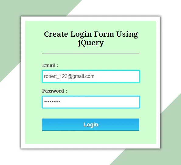
Keeping this mind, I’ve designed a small script to introduce a sliding login box into your website, just as you see in Twitter login page. The script comprises jQuery & CSS techniques to display this arty feature. Checkout the code below and try it yourself or simply download the ready to use files.
<script type=text/javascript>

	// jQuery to apply actions to the link
	$(document).ready(function(){
	    $("#login-link").click(function(){
	        $("#login-panel").slideToggle(200);
	    })
	})

	//jQuery to apply actions to the ESC key
	$(document).keydown(function(e) {
	    if (e.keyCode == 27) {
	        $("#login-panel").hide(0);
	    }
	});

</script>
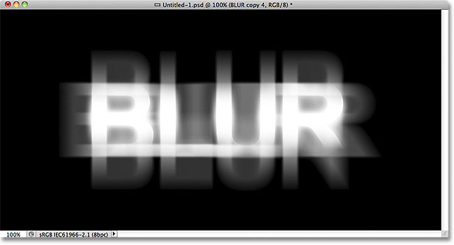
Its pretty easy to make some blurry text with CSS. We can do it by just making the text color transparent and adding some text shadow. Here’s the code for the same:
Blurry Text with CSS
To do it on the normal text we can create a class and use SPAN tag to make the text blurry.
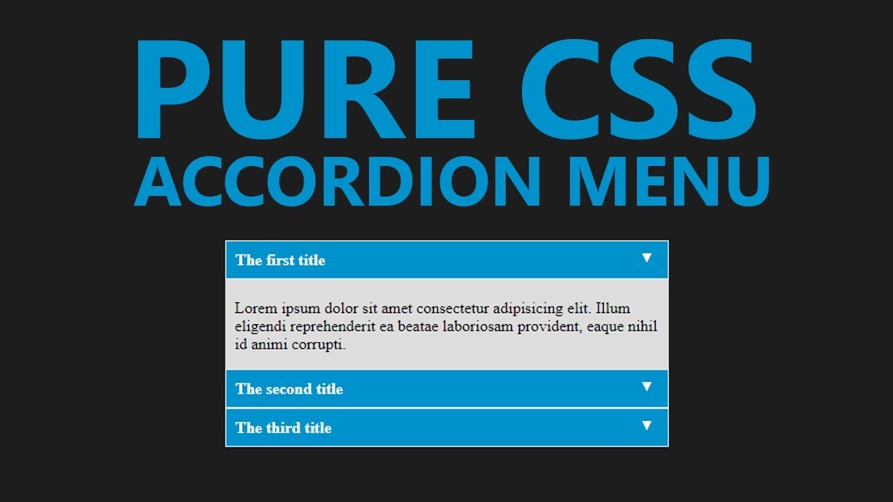
In this tutorial, I’ll create a CSS Accordion without using any jQuery or Javascript. As I mentioned in my previous post “An easy way to create Tabbed Content with jQuery & CSS” displaying a lot of information on one page is a bit difficult and we can use tabbed content or accordions to achieve the same without compromising on user experience.
We can always use jQuery to include nice effects on our css accordion. However, we are going to create a pure css accordion that will work on any browser, with or without javascript enabled.
Lets start with writing some HTML Code. We will use UL (unordered list) element to create our pure css accordion.
HTML Code for pure CSS Accordion:
<ul id="accordion">
  <li>
    <h2>Title One</h2>
    <div >
      Lorem ipsum dolor sit amet, consectetur adipisicing elit, sed do eiusmod
      tempor incididunt ut labore et dolore magna aliqua. Ut enim ad minim veniam.
    </div>
  </li>
  <li>
    <h2>Title Two</h2>
    <div >
      Tempor incididunt ut labore et dolore magna aliqua. Ut enim ad minim veniam,
      quis nostrud exercitation ullamco laboris nisi ut aliquip ex ea commodo.
    </div>
  </li>
  <li>
    <h2>Title Three</h2>
    <div >
      Quis nostrud exercitation ullamco laboris nisi ut aliquip ex ea commodo
      consequat. Duis aute irure dolor in reprehenderit in voluptate velit esse.
    </div>
  </li>
  <li>
    <h2>Title Four</h2>
    <div >
      Consequat. Duis aute irure dolor in reprehenderit in voluptate velit esse
      cillum dolore eu fugiat nulla pariatur. Excepteur sint occaecat cupidatat non
      proident, sunt in culpa qui officia deserunt mollit anim id est laborum.
    </div>
  </li>
</ul>
As you can see, I have a UL element and added a class named “accordion”. Within the LI element, I have H2 and a DIV tag with class “content”. And we will play with the CSS display attribute to create our pure css accordion.
Lets write some CSS code to stylise the same and hide our DIV.content within the LI tags.
As you can see in above code, we have used display: none for the div.content and on li:hover we have used display:inherit . The div.content is within the list element so this trick would work. If our div.content would have been outside this panel, we would have used jQuery to achieve the same.
Very soon, I’ll explain to achieve the same with jQuery and will use some nice animation as well.
Today we will play with jQuery CSS class methods such as addClass, removeClass, hasClass, and toggleClass and learn some basic implementation to modify the HTML styles on the fly.
jQuery CSS Class Methods:
Let’s understand this is a small piece of code. First things first, You must include the jQuery library in the <head>…</head> tag.
Now our page has the jQuery library so let’s add some HTML and CSS to play with the jQuery CSS Class methods.
HTML Code:
<div id="elem">
  This is a content panel
</div>

<p>
  <a href="#" >addClass</a> /
  <a href="#" >removeClass</a> /
  <a href="#" >toggleClass</a> /
  <a href="#" >hasClass</a>
</p>
Here we have a DIV tag with ID set to element and we will use this ID to play with jQuery CSS class methods. Below that, we have a paragraph element and four links with different class names. Let’s write some CSS code and I will explain the functionality of each link when we add jQuery code.
In the CSS styles, I’ve added some styles to our DIV#elem element and also created a class named hover which will change the background, color, and border of the DIV#elem.
Now let’s add some jQuery code and learn how these jQuery CSS methods work.
$(document).ready(function(){
	// Add the class
	$('a.add-class').click(function(){
		$("#elem").addClass('hover');
		$("#elem").html('Class added ".hover"');
		return false;
	});

	// Remove the class
	$('a.remove-class').click(function(){
		$("#elem").removeClass('hover');
		$("#elem").html('Class removed ".hover"');
		return false;
	});

	// Toggle the class and check if the class has been already added or not
	$('a.toggle-class').click(function(){

		$("#elem").toggleClass('hover');

		if($("#elem").hasClass('hover')){
			$("#elem").html('Class added ".hover"');
		}else{
			$("#elem").html('Class removed ".hover"');
		}

		return false;
	});

	// Checks if the class has been already added or not
	$('a.has-class').click(function(){

		if($("#elem").hasClass('hover')){
			$("#elem").html('Class found ".hover"');
		}else{
			$("#elem").html('Class not found ".hover"');
		}

		return false;
	});

});
In the JQuery code, I’ve used the click trigger for all four links we added in the HTML code above. Also, I’ve used return false; so when we click on the link it should not redirect the user to any page or use # in the current page URL. Also, I’ve added another line of code to modify the HTML of the #elem element when we click on these links. Don’t get confused with the .html() method, this is not required, I just added it to explain the functionality.
The first link with class .add-class will add the .hover class to the #elem element. If you want to add multiple classes with one trigger you can specify different class names separated with a space as we normally do in normal HTML code. Once we click on this link, .hover class will be added to the #elem HTML element and the inner HTML will be changed and show us the result. You can click on the address link above and see it in action.
The second link with class .remove-class will remove the .hover class from the #elem element. If the element doesn’t have a .hover class, it won’t do anything so the remove class will be used only to remove any applied class.
The third link with class .toggleClass will toggle the .hove class on #elem element. If the element does not have a .hover class it will add the same otherwise vice versa. In this code, I’ve used the jQuery CSS method hasClass to check if the element has the .hover class or not. and the content of the #elem element is changed accordingly.
The fourth link will only check if the class .hover is applied to the #elem element or not and change the HTML code of the #elem element accordingly.
I hope this will clarify any doubts on using these methods, in case you have any questions or suggestions, please use the comments below to start a conversation on this topic.
Links, Links, Links!! That’s what we have all over the internet. On our website and blog posts, we have a lot of links to point a user to another page. Today I will share a small trick to stylize the links with CSS3 Animation. That’s what I’ve used on this website and you can apply the same as well to change the link color with style on hover.
CSS3 Animation
With CSS3 animation, we can add some effects when changing from one style to another without using any flash or javascript. We will use CSS animation transition to add some cool effects to the anchor tags.
How it works
CSS3 transition effects let an element gradually change from one style to another. To do this we must specify two things:
Specify the CSS property we want to add an effect too. Specify the duration of the effect. Optionally we can specify “transition-timing-function” which is set to “ease” by default however, we can use any of these.
Try this code on a blank HTML page and add the CSS either within ... tags or in your stylesheet. Play around a bit with the CSS to understand the CSS3 Animation transition and create some cool effects for your website links and other block-level elements. Feel free to discuss this further in the comments. You can also contact IOGOOS Solution to build Website Animation Services.
Typography is the key element in the design process. While designing a web page, business card, brochure or newspaper advertisement fonts and text style plays an important role to get user attention. To design stunning elements we need fonts and fortunately, the big daddy provides a lot of them for free. We can use Google Web Fonts in our designs and they are pretty awesome and very easy to use.
How to use Google Web Fonts on a web page
It’s pretty easy to use Google Web Fonts on your website. You can do that in just three simple steps:
Choose single or multiple Google Web Font(s) from Google fonts website: //www.google.com/fonts and add them in your collection.
Hit the use link above the list of your selected fonts and Google will show you different methods to include these fonts on your website. Standard, @import or Javascript
I always use Standard method with a small trick to load the fonts before displaying the web page.
Here’s the code you would need to use Google Web Fonts on your website.
I’ve added Open Sans and Lobster fonts to my collection for this example.
<head>
<link href='//fonts.googleapis.com/css?family=Lobster|Open+Sans' rel='stylesheet' type='text/css'>
<!-- This will prefetch content from google web fonts website -->
<link rel="dns-prefetch" href="//fonts.googleapis.com" />
</head>
The above code goes within the [htmltag tag=”code”]<head>…</head>[/htmltag] tags and the DNS-prefetch link tag will fetch the contents from Google Web Fonts website. This will help resolve issues like font changes after the page load.
In the above CSS code, I’ve defined the body font as open sans and headings font as lobster. Similarly, you can use different fonts for different elements.
How to Use Google Web Fonts while Designing?
As a designer, we all need to design the mockups of the creative work before we can publish the same. If we need to use Google Web Fonts while designing layouts in Photoshop or Illustrator we will have to download the font and install the same in our Operating System.
Using Google Web Font Download Link
We can always click the Download link to save the fonts on our hard drive and then install the font on our operating system. However, what will happen if that font is updated and new characters are added or there’s a new and improved version available for that font. We need to keep a check and if the new version is available, we need to uninstall the previous version and then install the new version.
What is there’s some tool which can automatically do this task and save us a lot of time and effort?
Fortunately, there are tools available that can make our life easy and keep Google Web Fonts updated all the time.
Using Skyfonts to Download and Sync Google Fonts
Fonts.com has teamed up with Google to offer google web fonts for desktops via Skyfonts software.
We are proud to have teamed up with Google to offer desktop versions of their popular Google Fonts free of charge. Offered for use in print, these fonts are delivered using SkyFont’s patent-pending font delivery technology and can be used anywhere.
Each time a font is updated — such as when new characters are added — SkyFonts will automatically update the font on your device. Syncing Google Fonts with SkyFonts will also improve your web browsing experience, by cutting the time spent downloading fonts. ~ Fonts.com
Skyfonts software is available for both Mac and Windows. You can choose the fonts you want to use while designing and Skyfonts sync these fonts with your operating system fonts and make them available in all applications as normally installed fonts. If a new version of the installed font is available, the Skyfonts application will automatically sync and replace the older one with the new version.
Download Skyfonts Software
There are other methods available to download all Google Web Fonts on your computer, however, I found Skyfonts the easiest and most efficient to keep all the fonts updated.
Custom post types are a great feature introduced in WordPress 3.0 and it extended the functionality and practical usage of this awesome CMS. While re-designing / re-structuring iogoos.com, I have used Custom Post Types for different sections on this website.
Now I want to add all these custom post types to the main WordPress feed so the users get updated content from each section via RSS. There are two ways we can do that. You can add the below code snippets to the functions.php file of your theme.
1. Add all Custom Post Types to Main WordPress RSS Feed
function extend_feed($qv) {
	if (isset($qv['feed']))
		$qv['post_type'] = get_post_types();
	return $qv;
}
add_filter('request', 'extend_feed');
Function get_post_types() will return all registered custom post types. Here you can learn more about get_post_types() function.
2. Add selected Custom Post Types to Main WordPress RSS Feed
I’ve used the woo-commerce plugin for the shop section of this website and this plugin added a few more custom post types that may be not relevant or useful for my readers. So with the code snippet below, we can add a few selected Custom Post Types to the main WordPress RSS Feed.
function extend_feed($qv) {
	if (isset($qv['feed']) && !isset($qv['post_type']))
		$qv['post_type'] = array('post', 'tutorials', 'tips', 'snippets', 'shop');
	return $qv;
}
add_filter('request', 'extend_feed');
If you notice, here instead of using the get_post_types() function, I supplied an array of specific custom post types slugs. This will add content to WordPress’s main RSS feed only from the specified post types.